From Data to Design: A Beginner’s Guide to Creating Impactful Infographics
- graphicalization
- May 31, 2025
- Blog
- 0 Comments
Infographics are one of the most effective tools for communicating complex information in a clear, visual format. In a world flooded with content, people don’t want to read long reports or dense paragraphs—they want quick, visual, and engaging content they can understand and share. That’s where infographics shine.
Whether you’re a student, marketer, educator, content creator, or business owner, learning how to create compelling infographics can help you present your ideas with impact. You don’t need to be a professional designer or have expensive software—just the right steps and tools.
In this beginner’s guide, we’ll walk you through a step-by-step process for turning raw data into beautiful visuals. We’ll also highlight common mistakes to avoid, share free tools and templates, and answer frequently asked questions to help you get started with confidence.
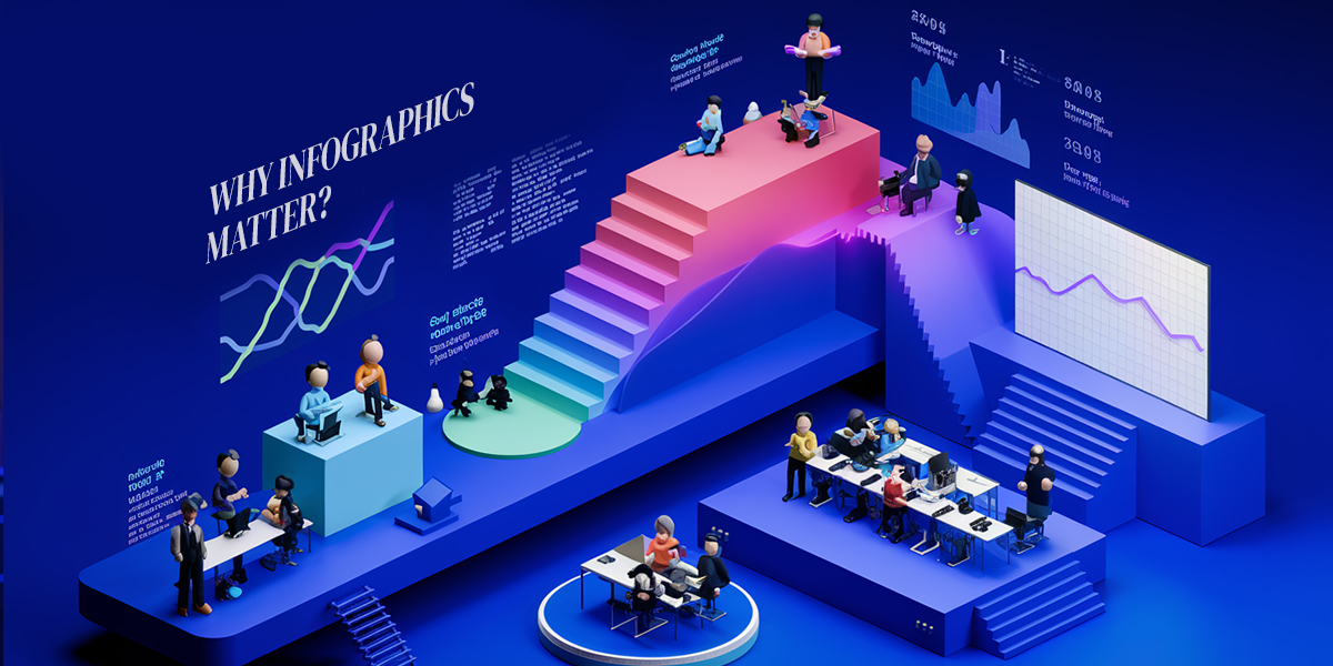
Why Infographics Matter
Infographics aren’t just pretty pictures. They’re a powerful method of storytelling. Here’s why they work so well:
- Faster understanding – The brain processes visuals much faster than text. Infographics help people grasp complex ideas quickly.
- Better memory retention – People remember visual content longer than plain text.
- Stronger engagement – Visuals get more shares, clicks, and interactions on social media and websites.
- Cross-industry use – Infographics are used in marketing, education, journalism, corporate communication, health awareness, and more.
In short, if you want your message to stand out, an infographic is a smart and strategic choice.
Step-by-Step Process to Create Infographics
Step 1: Define Your Goal
Before you open any design tool, ask yourself:
- What do I want to communicate?
- Who is my target audience?
- What is the main takeaway or action I want the viewer to understand?
Being clear about your purpose will guide every decision you make, from the layout to the data you include.
Step 2: Find Reliable Data
The foundation of every infographic is good data. Use accurate, up-to-date, and trustworthy sources to support your message.
Good places to find data:
- Government databases (e.g., data.gov, census.gov)
- Research and reports from trusted organizations (e.g., Pew Research, WHO, OECD)
- Surveys and polls from credible companies
- Your own analytics (e.g., website traffic, customer data, survey results)
Make sure to fact-check all data and include proper citations or sources on your infographic. This builds trust and credibility with your audience.
Step 3: Choose the Right Type of Infographic
Not all infographics are the same. Choose a format that best suits your content.
Common types:
- Statistical – Great for presenting numbers, percentages, and comparisons.
- Timeline – Ideal for historical overviews or project milestones.
- Process – Use step-by-step visuals to explain how something works.
- Comparison – Useful for showing pros and cons or side-by-side features.
- Geographic – Maps that show regional data or patterns.
Choosing the right structure will help your information flow logically and clearly.
Step 4: Pick a Design Tool
There are many tools—both free and paid—that can help you design professional-looking infographics. You don’t need design experience to use them.
Recommended free tools:
- Canva – Beginner-friendly with lots of free templates and drag-and-drop features.
- Piktochart – Especially good for visualizing data and stats.
- Venngage – Great for beginners and small businesses.
- Visme – Offers rich design features and good data visualization tools.
- Adobe Express – Lightweight, modern, and easy to use.
Explore different platforms to see which one suits your needs best.
Step 5: Structure Your Layout
Start with a wireframe or sketch to plan the flow. Think of your infographic like a story—it should have a beginning, middle, and end.
Design layout tips:
- Start with a strong headline that draws attention.
- Organize content into sections with clear headers.
- Use bullet points, icons, and visuals instead of long paragraphs.
- Maintain white space to prevent crowding.
- Use consistent alignment and spacing for a clean layout.
Structure helps your viewer follow your message from top to bottom, without confusion.
Step 6: Visualize the Data
Instead of listing numbers, turn them into easy-to-read graphics.
Common data visuals:
- Pie charts – Good for showing proportions.
- Bar graphs – Compare quantities side by side.
- Line charts – Show trends over time.
- Maps – Show geographical data or patterns.
- Pictograms – Use icons to represent quantities visually.
Always label your visuals and keep them simple—avoid complex charts that require too much explanation.
Step 7: Apply Good Design Principles
Even with strong data and layout, poor design can ruin an infographic. Follow these tips to stay on the right track:
- Use no more than 2–3 fonts for a clean look.
- Stick to a harmonious color palette that reflects your brand or theme.
- Ensure text is legible on all backgrounds.
- Use icons and illustrations to support, not replace, the message.
- Keep the tone and style consistent from top to bottom.
Use free resources like Coolors.co or Adobe Color to choose professional color palettes.
Step 8: Final Check and Share
Before publishing your infographic, go through a final checklist:
- Is the spelling and grammar correct?
- Are all data sources cited?
- Does it look good on both desktop and mobile?
- Is the message clear at a glance?
- Is there a call-to-action (CTA) if needed?
Once finalized, share your infographic on social media, websites, email newsletters, or print it for presentations. You can also submit it to infographic directories to expand your reach.
Common Mistakes to Avoid
Even simple infographics can go wrong if you’re not careful. Avoid these beginner pitfalls:
1. Information Overload
Too much text or too many visuals can confuse your reader. Keep only what supports your main message.
2. Weak Visual Hierarchy
If everything looks the same size and color, nothing stands out. Use size, bold text, and spacing to guide the viewer’s eye.
3. Poor Readability
Tiny fonts, low contrast, or busy backgrounds can ruin your design. Make sure your infographic is easy to read on all devices.
4. Inconsistent Style
Mixing too many fonts, colors, or icon styles creates a messy look. Stick to one theme and tone.
5. No Clear Purpose
An infographic should always answer a question or solve a problem. If your purpose isn’t obvious, go back and clarify your message.
Free Templates and Resources
To speed up your process, you can start with pre-made templates and customize them.
Free infographic templates:
- Canva Infographic Templates
- Piktochart Templates
- Venngage Templates
- Visme Templates
- Adobe Express Templates
These templates are great for saving time and getting layout ideas.
FAQs – Frequently Asked Questions
1. Can I use infographics for business?
Yes! Infographics are useful for marketing, internal training, pitch decks, customer education, and social media engagement. They help businesses communicate faster and more clearly.
2. How long should an infographic be?
There’s no fixed size, but most effective infographics are between 600px and 1800px tall. Keep it concise and avoid overwhelming the viewer.
3. What’s the best file format to export infographics?
PNG is good for web, JPEG works well for email and social media, and PDF is best for printing or presentations.
4. Can I make infographics without design experience?
Absolutely. Tools like Canva, Piktochart, and Venngage are designed for non-designers. Templates make the process easier.
5. Do I need to cite my sources in an infographic?
Yes. Always add a small line at the bottom to mention where your data came from. This builds trust and credibility.
Final Thoughts
Creating impactful infographics is a valuable skill for anyone who wants to communicate ideas visually. You don’t need to be a designer—you just need a clear message, accurate data, and a bit of creativity.
Start small, experiment with layouts and visuals, and learn as you go. With practice, your infographics will become sharper, more engaging, and more effective at delivering your message to any audience.
Whether you’re explaining a process, presenting research, or sharing tips, infographics help you stand out in a crowded world. Use this guide as your starting point—and start turning your data into design today.


